
JX3
JX3
A fresh new look for an MMA gym.
Design Brief
Looking to rebrand the company, JX3, I was happy to work with an existing logo, utilize aspects from the previous design that were desired to be kept, but nonetheless give this MMA gym a fresh start… with a bit more personality.
What was asked
Doesn’t like the “J” in original design.
Wants logo to be more MMA focused.
Stars can go.
“Street art” (to reflect the gym being in Miami)or script typeface.
Incorporate red end of Jiu-Jitsu belt.
Sketches

What we’re workin’ with…

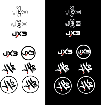

Standards
Typeface
“A Another Tag” by Wahyu Eka Prasetya on DaFont
Color Palette
#ffffff(white)
#000000(black)
#ed2024(red)
Design Process
Considering that I have zero experience with mixed martial arts and little to no experience with the clientele or athletes that make up this community, a lot of research went into my original designs and the process it took to get to the final logo. I spent a lot of time looking into graphic elements associated with the MMA and fighting community like boxing gloves, belts, arenas, etc. and the colors and fonts normally associated with other brands. I came to the conclusion that these designs were commonly masculine, black/white, bold, and aggressive.
Incorporating a “street art” element, something usually informal and loose, into a design that I originally planned to be tight and concise posed a bit of a challenge. Graffiti typefaces often become jumbled together and aren’t ideal for a logo due to illegibility, so I took a logotype and adjusted it in Illustrator to be more of a custom typeface to give this brand individuality, personality, and legibility.

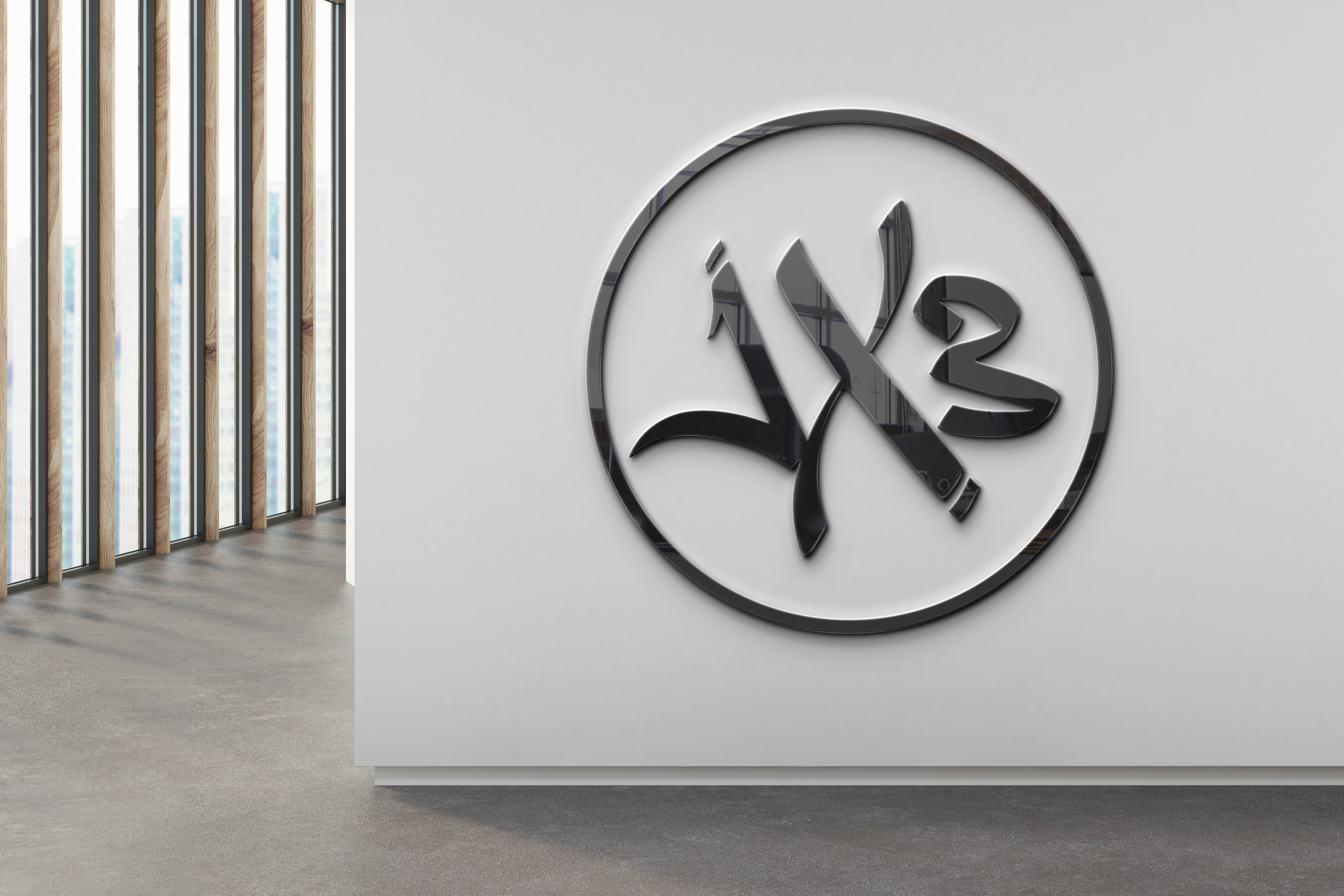
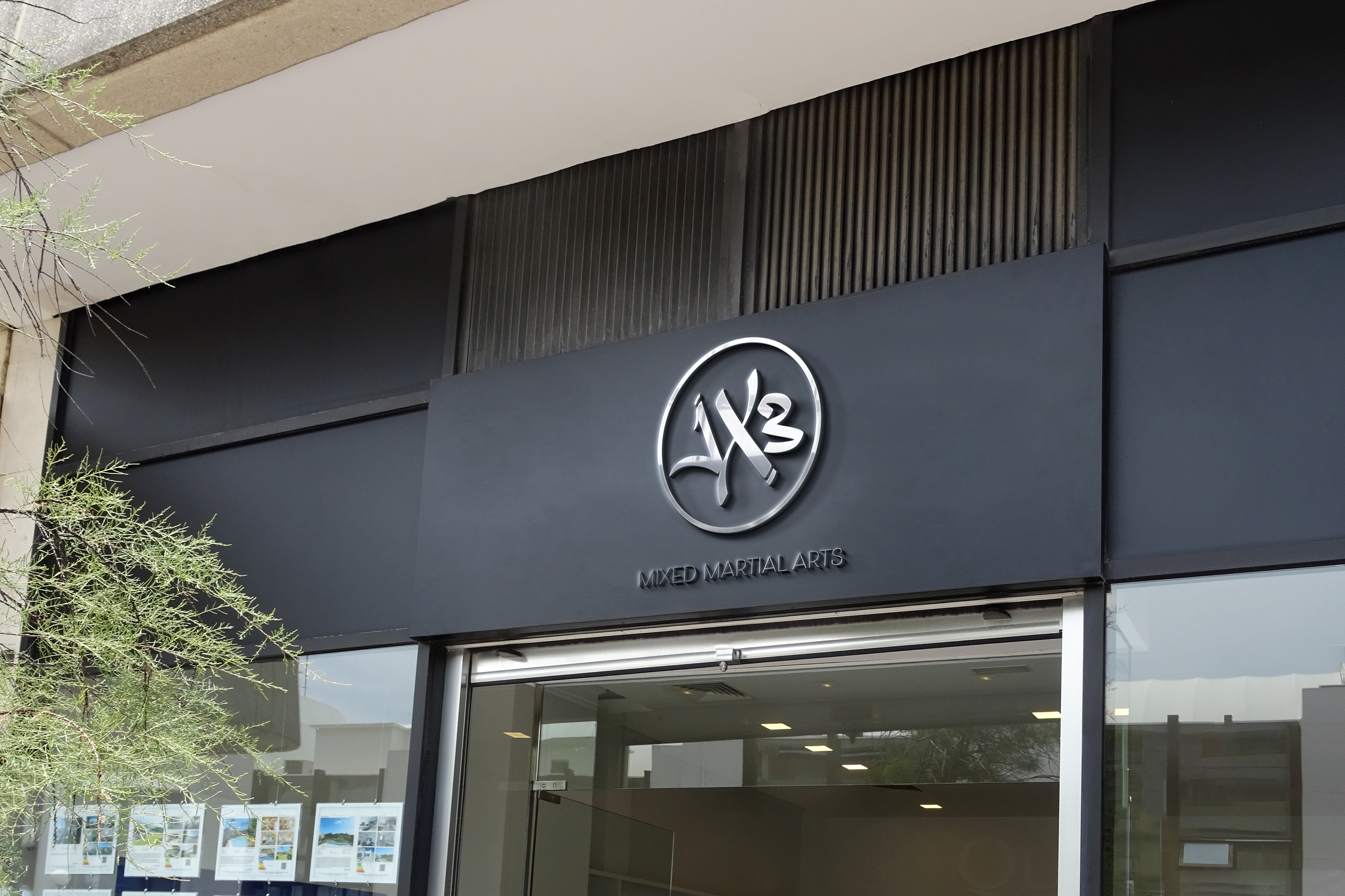
Final Chosen Logo
Mockups


